ok so i lied lol i do know how to make these
lemme paint a picture here
Since the last time I made an honest attempt at a blog one new Thing You Have To Do as part of a website1 that wasn't there before is the pictures for social media. You know them, you love them, they are movie-shaped for some reason, looks real bad when you don't have one. This is normally a small part of the process of releasing a website. Somehow this ended with a 5,000 word post. Slightly above an average AO3 chapter.

Anyway when I started the blog I really wanted my dopamine for releasing something into the open and didn't wanna deal with the images so i grabbed an envelope i had at hand2 and wrote this on it, uploaded it, everything was fine. I even found a purple sharpie that's on brand. great stuff!
Weirdly enough I used to be big in the world of generating images on the fly. At the time this was fundamentally jerry-rigging together infra for e2e testing of websites that took browser screenshots paired with a custom made 'website' that just happened to look like the image I wanted. Throw away the testing part and you can get really fancy with this.
Back in 2018 i considered this to be clowny, absurd, a massive waste of resources freely provided to me by ZIRP-era tech companies and in general it was a lil like it did the job good enough for me you know but surely real experts use image libraries or something.
Anyway none of this really something I obsessed over until this month when suddenly I needed to make these again and thus had to check how they are made for real in 2026.
How they are made for real
They are still screenshotting the fucking websites.
The state of the art seems to be this thing from Vercel that pulls 1,160 dependencies to generate a SVG for you. Which is not even the hard part svgs are code you can just write them jesus fuck anyway this is all implied to go to a wasm port of resvg3 which i feel is only not a web browser on a technicality but fair enough.
You should use this btw, it's really solid stuff. It'll do everything you want. There's a reason it's beloved, looks great. i would use it on somebody else's website it's just for this one it seemed like Work rather than Fun.
Lil aside: what is in an image?
Most images contain a very dense bit-like representation of the picture as pixels or blocks or in general just 'data'. Think 0101 as a 4x1 picture alternating black and white.
SVG is different in that it's closer to a traditional website. You can open them in a text editor and see markup and you can generally read it. They may not make a lot of sense if they are compressed but in general they are fine.
SVGs being markup, they generally need to be 'converted' into 'real' images by your computer before seeing them, sadly for social media images most providers want you to do this ahead of time instead of them and only want PNGs or similar.
Not gonna lie, I kinda assumed you could just use SVG here by now lol. You can on favicons. With that option seemingly off the table and not really wanting to figure out how to cobble together the other package I figured I might as well have some fun.
Enter bitmaps
When I was a child I was very dumb and also lived in Spain. The version of Paint on my computer didn't call them a bitmap but rather a 'map of bits'. a really evocative term making you think of pirates and treasure. I think this sparked an interest in me imagery in computers that somehow was not ruined after finding out its just a long list of all the colors in the image left to right.

This is in contrast with more advanced formats which use better forms of compressing the data inside. (This is also why you can zip a bmp to great effect but a webp just gains size at best!) Wait..a list of pixels? that sounds easy enough to manipulate in code! If i can draw a cat like this:
........
..x..x..
..x..x..
........
.x.xx.x.
..x..x..
........
It can't be much harder to draw a cat in pixels right? And it really is not. Drawing anything slightly more ambitious is though, like a lot.
I waltzed to NPM and searched for BMP figuring out somebody must have done a little library to mess with them already, turns out there's not a lot of interest in this image format considering there like 400 others and they are all better, who'd have guessed.
fast-bmp
The closest I could find was fast-bmp.
I was really expecting to find some high level libraries here. draw some boxes, position them, have that solved for me. Fast-bmp is not exactly that but rather it deals with converting BMP files into objects that you can work with in JS and back. This is still super useful so let's roll with it.
It's also not super fast but I can only assume it's faster than anything else you could use? There's only so much you can optimize for when populating an insanely long array of numbers in node. Ask me how I know.
Another lil aside: bitmapv5
I was naive in thinking the BMP file format had anything to do with pirates as a child and it turns out I was naiver to think it was 'just' a list of colors in order as a big child.
There's nonsense like 'channels' and 'color masks' and opacity. when you get to BITMAPV5 (how are there five versions of this) we are now talking color spaces, gamma curves, business justification for this bitmap to exist, and compression.
That's right, a bitmap can also just carry a jpeg inside. Why the hell not.
From doing some initial messing it still took me a couple tries to just create a bitmap file that actually 'worked'. By which i mean that fast-bmp would read and that whose insides I could make sense of. 4 After many tries and exports I did eventually manage to open a 4x4 image and stuff my own pixels inside, behold this masterpiece:
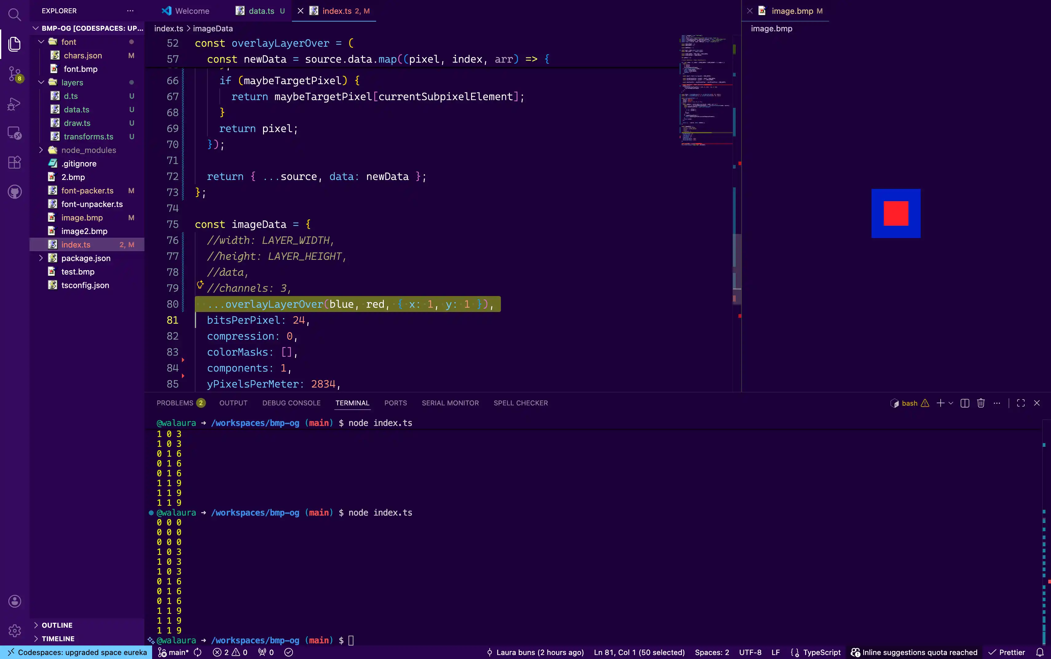
If you have ever done creative coding you already know this but I was over the moon after seeing this ugly piece of garbage, that's the hard part!!! – Coding-wise – I can put arbitrary colors and shapes in an image of an arbitrary size so now I just need to put some more pleasant ones.
Also, just to boast, turns out my intuition for smaller BMP formats was mostly right. Even without all the advanced crap, assuming they are all RGB, they come in four different 'pixel densities' if you wanna call them that:
[0|1]1 bit, marks a color in a palette set somewhere else. useful for fonts.[??, ??]presumably has to exist but its cursed and i don't care. probs more paletted colors.[0|255, 0|255, 0|255]- rgb, easy, simple, my fave[0|255, 0|255, 0|255, 0|255]- rgb with alpha which i think is at the front but i don't remember
Text rendering
Social media images really ask for text, like the title of the post or whatever. It's easy enough to write some words but how to actually turn them into pixels?

Ever noticed how ChatGPT was really bad at writing text and it got magically good at about the same time it developed a very recognizable style? it's not even trying, it leaves holes and then overlays good old style text layers from a separate path that cant draw 5.
And this is fair! One guy solved this problem once 30 years ago and we are still fundamentally using that. Figuring out an actual text layout algorithm sounds as fun as manually reviewing my cookie settings on the Disney+ app to ensure I'm only sharing data with partners I trust so we aren't doing that let's try to roll our own.
NOTE: Very much like everything else, text just gets insanely more complicated when you remember there's a world outside your narrow anglocentric worldview. Luckily i don't have to do that, and using a lo-fi style excuses eating up accents and rendering stuff like 放屁和拉屎 呵呵 as a bunch of question marks.
If you've never tried to lay text out you should start with monospaced fonts, no line breaks, spaces as a character. this is easy because all you really have to do is keep a counter of which letter you are at and put it at pixelSize * index horizontally and 0 vertically:
// h|e|l|l|o

const charSpace = (letter, index) => {
  return index * 10
}
Now of course we need line breaks, this is also easy (less easy) if you don't mind breaking words in half. It boils down to figuring out the size of the character before plopping it down and if it will run over the max width, make a new line. Once you are there just do it for words (as separated by spaces) instead of characters and you are golden.
const MAX_WIDTH = 80;

const wordSpace = (word) => {
  const chars = word.split('');
  return chars.map(charSpace)
}

let lines = 0;
let lineWidth = 0;
for (words of sentence) {
  lineWidth += wordSpace(word);
  if(lineWidth > MAX_WIDTH) {
    lines++;
    lineWidth = 0;
  }
  // lay out the word
}
Throwing in a non-monospace font just means looking up the size of every individual character from somewhere rather than assuming they all are N pixels. This is easy if you break it down! (still took me several days and bugs, don't copy this code)
Everything that's not text
I tried to make this a little fancy. since I was looking for a javascript library to sort of draw on bitmaps canvas-style and it didn't exist i made it.
Javascript..in a browser?
Midway through development i noticed there isn't really anything here that would necessitate a server environment. Sure, I wanna make this images on a server but this should..run? I spun up a quick parcel scaffold and yeah turns out it does run
This is fundamentally useless for you but it was huge for me because debugging perf gets so much easy when you get a little flame graph. it helped me find out everything i thought would be slow is fine and things I thought would be okay are actually big nonos. Not sharing all the learnings because I'm still not sure I did anything right.
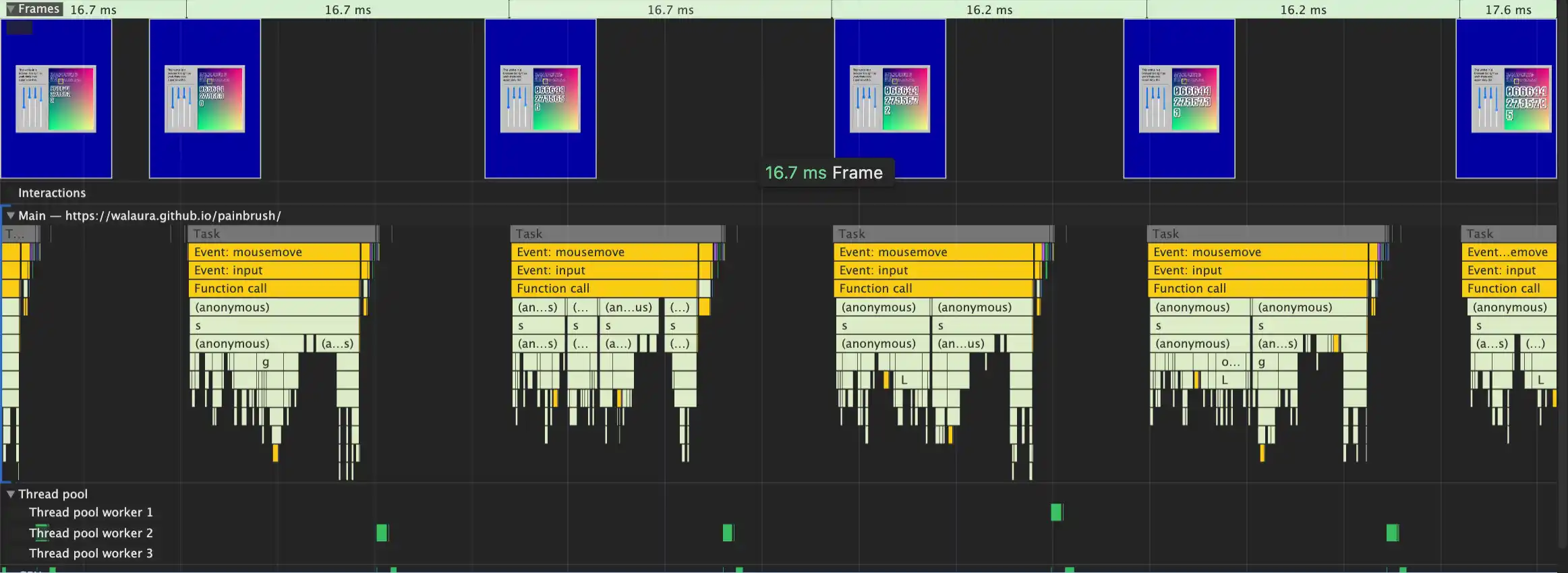
As the project evolved from messing with a bitmap to creating and compositing several bitmaps not only i completely lost track of what I was doing in the first place (images for this blog) and got bloated as shit. it's now a fairly featured bitmap editor comparable to Paint in the 90s which is not saying a lot but hey, Paint needs a $90 copy of Windows and I'm giving this away for free.
I'm actually really proud of how the public-facing API came through, it's clean enough and this turned out to be critical because i ended up going back and forth A LOT.
The main concept is Layers. You create layers for text, images, whatever. All layers end up as a big bag of pixels and they can be turned into an image at any point.
This rocks for debugging because on complex compositions it's really easy to 'bail out' of a complex layout and just render a problem area.
- Layers can get transformed with operations. think scale, rotate, etc. under the hood these just make new layers with custom brushes that read the old layer to decide the content.
- Layers can also get composed over other layers. For example, making text 'just' composes characters (which are layers themselves) over an empty layer.
If you aren't composing an existing layer, you can paint directly on the pixels of a layer using a Brush. Brushes are a function you pass on to many layer creators, they run on every pixel, receive a pixel index and layer data (like width and height) and use this to return a color to paint on that pixel.
makeLayer.blank(
  { x: 10, y: 10 }, (index, layer) => {
    return index * 100;
  }
);
Why not just receive x and y? because at the time that was nontrivial compute to run per pixel or so I thought. Especially because everything is brushes, so normally you will just do something like this
makeLayer.blank(
  { x: 10, y: 10 },
  brush.solidFill(0xff0000)
);
Which does not really care for any of the pixels, just returns a brush that ignores its arguments to then return the same color every time.
Arrays: the more you know
Composing in particular is how I found out JS Arrays are slow. Like, they are fine for crud apps but initially my compositor would try to blend pixels over and wastefully loop over the entire back layer instead of the smaller front layer6. For making text I was making one massive layer full of pixels just to override most of them with the text.
Something I didn't see coming: copying a long array takes time. [...like_this]. The second biggest perf optimization I made was implementing a fast path compositor that overrides the back layer and skips blending altogether, which you don't need when creating stuff like text.
The biggest perf optimization is also, honestly, the funniest. JS arrays are not efficient at holding small known-length values like, say, 8 bits. So why not hold the whole color inside. Faster to loop over as well.
With all the layer and brush abstractions, moving the underlying rendering to use 1 slot per pixel in hex was relatively easy and also way cleaner to reason about! At commit time I expand this back into 3 separate values.
With the benefit of hindsight there's two extra thingos I wanted to try out but never did because things got fast enough:
- All layers are 'real' rn but they don't really have to be. if i wanna scale a layer maybe I don't need to walk all over its pixels just yet, it can wait until I do the final walk at generation time. Same w transforms etc. This sounds hard tho.
- Do we need an array at all? can this be a long string? I don't really need any of the array features anyway. I know the length and each chunk size ahead of time so maybe that speeds stuff up at the cost of memory?
Anyway that's the glasses nerd shit over with for now, lets go back to the paintbrush nerd shit:
(scary quotes) Fonts
There's many ways of moving a pixel font to JS, normally I'd just ascii them in the text editor like its advent of code but since I already had a bitmap library in there I figured I'd use that? I started small with a 11 char 6x6 sprite sheet with ?0-9A-Z, easy if you forget ! and commas exist!
When it came to supporting other fonts the original plan for enriching this was to encode the metadata on the image but then I figured it wasn't worth it and now there's a JSON alongside the font. Simpler. For the code art at least.
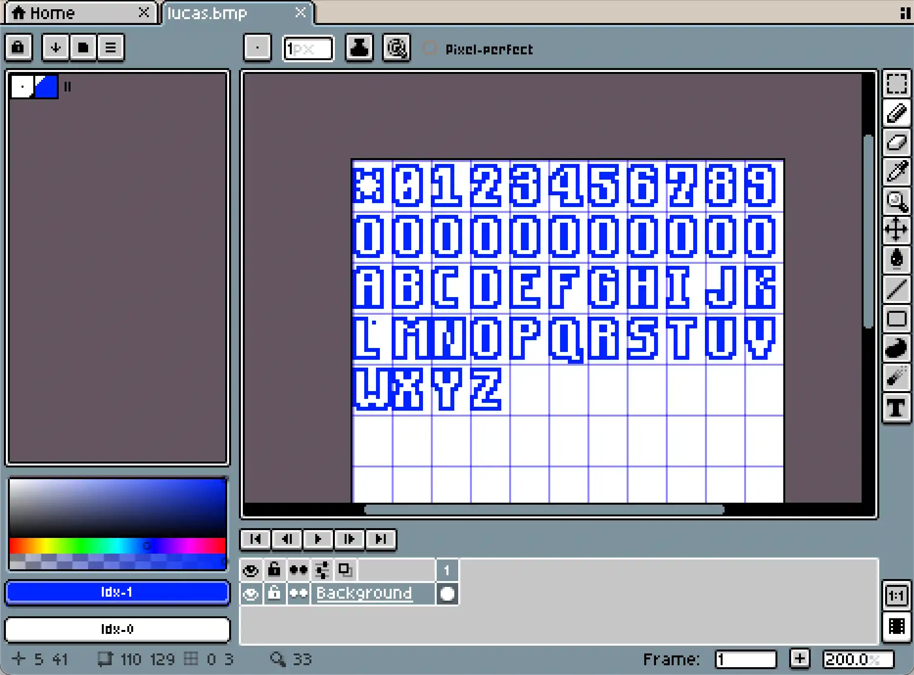
There's a lot of art to making pixel fonts. Lucas here is inspired by stealing the look of LucasArts graphic adventures and I use it for the clock demo on the web version. If I can nerd out for a moment I love how well the 7 works in this grid, and how tall the G stands.
Two fonts I it started to set how all monospaced fonts i know to draw look too code editor-y. not what we are going for here, so I implemented the worst possible way to encode variable widths. An insanely long list of pixels to trim off the right edge, per character. This is why some characters here are 'misaligned'. They will get cropped.
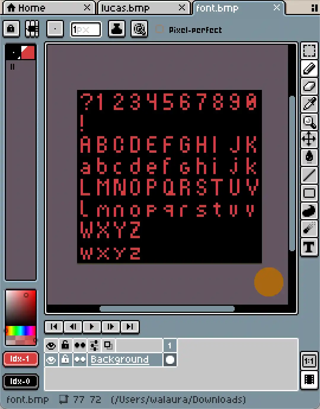
Poxel here is the font I bundled in as the 'default' font. A really fun limitation of this system (and of real fonts i guess) is descenders - that's the droopy bits gpqy and so have at the bottom - and unless you set all your characters crazy high they just don't really fit 1:1 in a pixel font.

Poxel just does small caps for these. Lucas does not bother and is caps only. For the images in here (I'm getting to that i swear) I got in way over my head, built up a little more room to work with with a 15x15 grid, and went for compact descenders like Monkey Island.
This is the only reason the post has a g on its strapline, so you can tab back and see it on the image. Go do that now, I love those g's. But now it's time for yet another detour. Fun!
Productionizing javascript in 2025
At this point in time the website was a distant memory and what I had was a relatively convoluted monorepo with 3 packages dedicated to making crude Paint drawings. The plan was to publish this to NPM in case somebody else wants to use it (wink wink) and consume it downstream from the website. Some quick learnings:
- Node will let you run typescript natively so that's awesome. Love being able to take a hammer to one side of the code and seeing what fell on the other.
- NPM is now super annoying about security which sounds fair they kinda implicitly control all the important computers in the world now. I need to relogin with biometrics for every push.
- Vitest is pretty cool. I used copilot with Qwen locally to write the tests and it was kinda fun to see the computer power through it. The tests were ass and I got a little badge of shame on the commits for my troubles but it beats no tests i guess.
Not typescript causing issues
I proudly wrote npm publish, published 1.0.0 and went on to work on this blog an-haha no I'm kidding. Turns out Node will not let you use typescript on packages? That's why everybody still uploads JS with those d.ts files that make it really hard to read the code? I though they were just being dicks about it. 7
Anyway so after some immensely messy pipeline work i finally got 1.1.0 published. With javascript this time. If you look at the package now it's sitting at 3.3.2 so I might as well tell you all the things that went wrong. Feel free to skip to the next heading if you are just here for the fonts! I would consider this a big compliment.

1.3.0unfucks some imports that only worked on my machine.2.0.0does the aforementioned optimization with the single pixel per array key.2.0.1and2.0.2try to put the readme back in the NPM page bc i wasn't copying it to the JS folder oops.3.0.0i suddenly decided the API was a mess and made it neat and tidy.3.2.0i suddenly decided that API was even worse and made it neat and tidy.3.2.Xmy text was inexplicably overflowing and i added a crop function to normalize images because.3.3.Xall that gloating from before about the font rendering? the font rendering was all wrong in terms of when to break lines and I never noticed.
Anyway, you should use my library. It's good! I mean, now it is. It better be.
Babushka Sans
So here we are, back to lots of grueling work after it was time to plug this onto the website (this one). After working this hard on a pixel text engine I was kinda done with overly pixely text so I went on to look for some pictures of old Sony devices for inspo. They were doing a lot with the tech they had while looking just a little bit quirky.

I'll spare you the big details because I'm no typographer. I just drew three fonts I guess but I've also been writing code for 20 years and i wouldn't call myself a 'software engineer' that's for nerds. So instead imma just list some of the things I quite like:
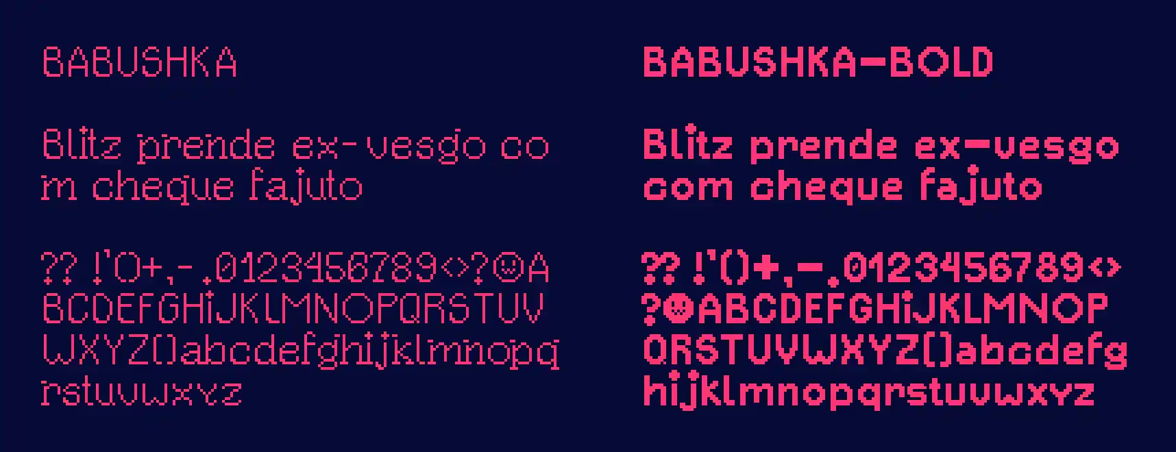
- The hanging serifs in
gkmnpqrthat sadly i couldn't quite fit for the bold font. I's are always dotted. i used to get shit for not dotting mine when writing by hand so there hope my classmates are happy now. they r cute.- The number
4. just, look at it. Also lowercasey. - The thick-ass dots all over bold.
Bold is a bit of a hack job that loses a lot of the whimsy and that's just the price you gotta pay for bold if you don't know shit. I really like that they don't just look 'pixel' (Like Poxel does) but rather they are going for something. Closer to Tahoma on windows XP than to Zelda 2 if that makes sense.
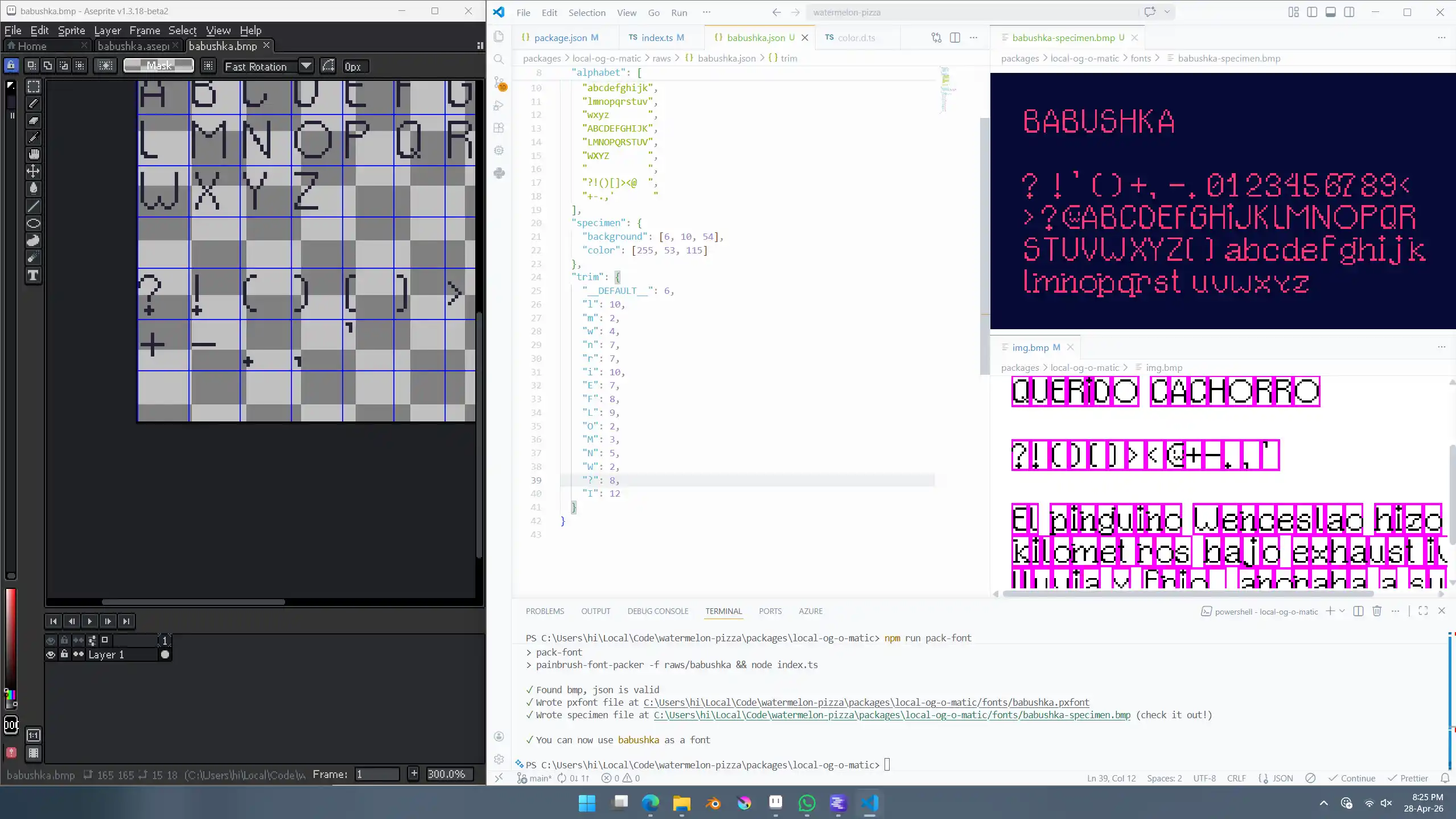
Drawing the characters is the fun part, if you wanna call it that. After that's done and you got them all laid out on a sprite sheet comes the immensely grueling work of cropping them all to size. I kinda hated myself for not figuring out how to encode this on the bmp but ended up with a relatively nice workflow anyway where i had node auto refreshing two different specimen files as i was messing with pixels.
Powering through
I forgot to turn off the local ai's next line suggestions so every other line VS Code would try to help and suggest where to trim a letter. never got it right but to be fair how could it. This was happening as salsa kept trying to help to by walking all over the desk. All the small creatures in the house conspiring against me at once. It only fueled my determination to get this done.
A really nice-in-an unexpected way feature of this whole stack was a combo of being able to draw in the background of each 'letter plate' (because they are layers, remember) alongside a little border brush i made just to test out the API. Put them together and suddenly you get a great debugging outline on each character. Insanely helpful. Should have put this in the docs for Painbrush.
Hooking it all up
This is where things took a bit of a turn. First, I wanted to really stick with native parcel since it offers image compression, my though here being that i can serve you a BMP from my code and pass some arguments somewhere to magically turn it into a gigantic PNG. 8

Parcel, like every other ==javascript== bundler out there, offers a deranged plugin system that fulfils every conceivable need except the one you have. First of all it's smart enough to extract assets from code, so I can just make up a link to a file that does not exist and that's enough to get parcel looking for it. Cool!
(I mean, the file really does not exist, so that's a problem)
You then define a Resolver which is one of the plugin types. This one basically steps in to resolve a file. Normally this just goes to find it in the filesystem but you can also make one up on the spot. This is great stuff! Anyway, when you make up a file like this you can't actually return binary files, just code.
"Not a problem!" i say with my unflappable spirit. "I can use this path to figure out what the text in the image should say and then pass it down to another plugin". Words come out of my mouth with barely any conviction that any of this really beats just installing the parcel library like a normal person. maybe Netlify just has a button to make these images too? Not the point, I'm too deep.
I whip up a transformer plugin that takes this PXMD file that at this point is a bunch of JSON with post metadata because why not, whatever rules existed for anything are long broken, and use that to finally generate the damn image all that's left to do is convert it using the built in stuff and –
This module supports reading JPEG, PNG, WebP, GIF, AVIF, TIFF and SVG images.
Okay, small setback in terms of the project where at no point it occurred to me to check if the image manipulation library that I had at hand even supported the BMP format. Finding out that all along i had a svg rasterizer library available to me would have been a big moral setback if I wasn't finding out right now at the time of writing and looking up the quote above because I'm a terrible reader.
This is actually really funny and im not mad
I swear to god if you do your own research on og images and whatnot for the little time i put into it you will likely come to a very similar conclusion where rasterizing svgs is an insanely hard problem in computer science. Fucks sake, some guy at Vercel built an entire text rasterizer pipeline to then feed to some nonsense in rust because that doesn't even render text??
And all this time rasterizing svgs was just a feature of normal image libraries the second you step out of website land into actual usages land?? it's just not shiny and glamorous?? And you just know this is perfect at text because it's what the fucking Wikipedia uses?
Anyway scratch my comment on line 262 about OpenType, there's at least two text processors in town. we truly live in an era of wonders. Suddenly I feel less bad about my own jerry rigged approach.
Okay so using Parcel or Sharp is a goner. I too didn't do my research but vaguely remembered Imagick being a thing. All command line options are a big no-no because they take a file as a parameter i think and at this point this just doesn't exist yet so anyway - there's a wasm version and i plugged it in.
I know very little about this part of doing software so all i can really brag about here is converting a callback to an awaitable. brought me back to the 2010s.
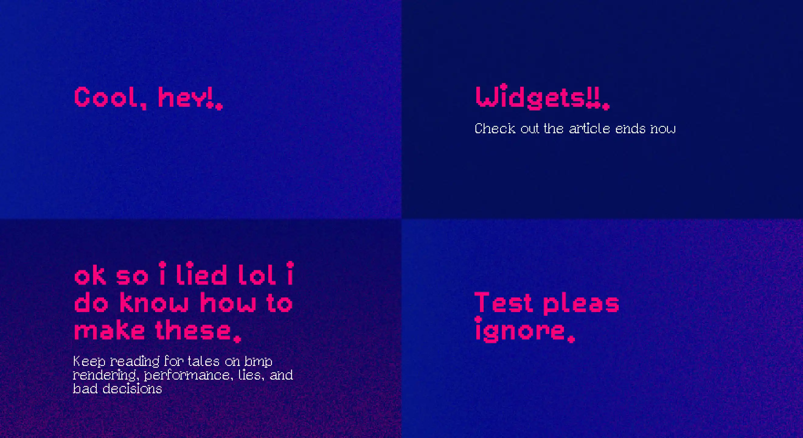
And this is everything! The backgrounds are using a custom brush that messes with the values in HSL to make them glitchy. there's a lot of cool effects you can make with this setup and i landed on boring :( I'll probably tune them further over time.
Quick tldr and other stuff
Check out my cool JS Bitmap manipulation library here,
Aseprite is great for manipulating BMPs, its gonna show up on my last played row below because i bought it on steam.
If you wanna do your own images you probably wanna just use a svg and Sharp. Unless you want them pixely in which case you can use mine i guess!! (Just don't steal my font from here tho! Poxel is fine)
You can see a Windows path on the last screenshot and this actually worked out super fine until the very end when parcel couldn't figure out the asset paths and that's how I ended up using WSL (it's great now btw).
Background is from Katamari ripped by Lumpy Spirit.
Aaand thank you for reading this far. As usual lemme know your thoughts on bsky!!
Footnotes
-
lots of things i don't have to do anymore tho which is awesome! this barely works on mobile, modern CSS negates the need for pirating photoshop and I don't really have a stick up my butt on code correctness so this is all being fun for once. Oh yeah and Netlify is dealing with https, that seems to work so that's awesome. ↩
-
its 2026 i don't really have access to Paper, per se. ↩
-
this will turn out to be weirdly prophetic ↩
-
if this all sorta interests you but the messing with saving files part doesn't i left some easy starter bitmaps on the NPM package i published, have fun ↩
-
the source for this is my ass. while we know there's some sort of multi modality going on there's no specifics. Could be a second LLM trained on pictures of text which i guess are easy enough to generate??. Or they lie and just overlay pictures of text lol. Anyway Comfy and Weave which are more commercial-focused and let you peek behind the scenes both offer trad text overlays, you can let models layout them but they hand out the pixels first. ↩
-
back and front layer very literally meaning the layer that sits behind or in front relative to the viewer at the end of the operation. for most compositing front will be smaller as you are writing characters in a bigger square for example. ↩
-
there's also another detour where i needed to reset my 2fa, at some point i lost the keys. support was really nice about this. ↩
-
big mistake but I didn't know this yet so neither should you. ↩